
Come Visit Me at the New Site!
July 27, 2013 § Leave a comment
Hi folks! I moved! Please check out www.tennysontippy.com/blog to view past, current and future musings on art, design, decorative history and beautiful things. Thank you for visiting!
Eggplant and Champagne. A perfect match.
February 28, 2013 § Leave a comment
 While enjoying a lovely pre-spring walk, I snapped a photo of a favorite home in my neighborhood. Years ago, when I first saw the house, I thought the colors a bit (too) daring. Maybe even garish. But after many evening walks, these paint colors have warmed their way into my heart. I now see their combination as strong, inviting, and livable. Far from the acidic yellow and candy coated purple on the color chart, these complimentary colors truly do compliment each other.
The Eggplant and Champagne combination (and it’s variations) is timeless, provocative, and in it’s own way, quiet.

courtesy of atlanta-homes-lifestyles

Photo © Matthew Millman; Jute Interior Design
The Magical Power of Early Color Photography
February 22, 2013 § 1 Comment
 I recently discovered the Autochrome: the world’s first color process photography. I imagined color photography prior to Techicolor (the visually rich world of mid-century films like Gone With The Wind and National Velvet), would represent an either extreme or muted version of reality. However, the Autochrome’s subtle texture and soft hues capture something so real and vivid about the world that I now see digital photography as a bit more stark and sterile. Over a hundred years since their capture, these autochromes still feel alive and vital.
I would love to fill a wall with these photographs. They would enrich any room, and the lives of it’s inhabitants.


 A Brief History
(From npr.com) In 1903, the Lumiere brothers patented the first commercially successful color process, which they called the Autochrome Lumiere. It involved glass plates, a backlight, soot and (oddly) potato starch — and it revolutionized photography. Magazines like National Geographic started dispatching photographers to shoot with autochromes; documentary fieldwork became more feasible with this relatively portable medium. For about 30 years, it was the most widely used process for capturing color.

Map It! My top picks for Map Wallpapers
February 6, 2013 § Leave a comment
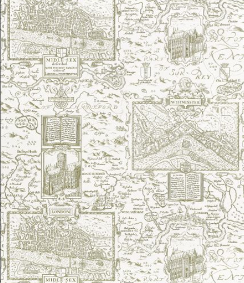 LONDON by Thibaut
 I love a good map wallpaper. In general, transforming something typically viewed at a small scale into something oversized makes for some pretty interesting and fun wall surfaces (like this one!)
Maps, often seen at arms length, become magnificent illustrations when seen at 20x their normal size. Map wallpapers make wonderful feature walls, often requiring little additional styling.
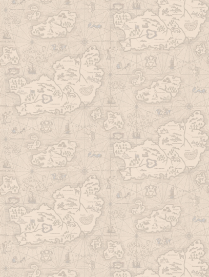 Ferdinand by Sandberg
I love a good map wallpaper. In general, transforming something typically viewed at a small scale into something oversized makes for some pretty interesting and fun wall surfaces (like this one!)
Maps, typically seen at arms length, become magnificent illustrations when seen at 20x their normal size. Map wallpapers make wonderful feature walls, often requiring little additional styling.
 London -by Zoffany
Map wallpaper can take on many styles, from a studious masculine look, to modern nautical, there are maps for any mood.
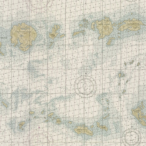 Great Harbor-Ralph Lauren Home
 Desert Map by Ralph Lauren Home
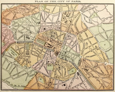 1889 Map of Paris
Beautiful Disasters: Why We Love Shipwrecks
December 31, 2012 § 1 Comment
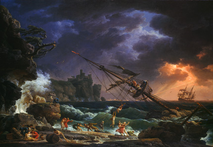 Claude Joseph Vernet, The Shipwreck, 1772 (National Gallery of Art, Washington)
I visited the Philadelphia Museum of Art’s exhibition, “Shipwreck! Winslow Homer and ‘The Life Line” on a blustery, snowy December day. A perfect setting to absorb the chilly, complex, and sensual shipwreck paintings curated from a diverse group of artists spanning the course of 150 years. The show’s central piece “The Life Line” is one of Homer’s best known, but not his best.
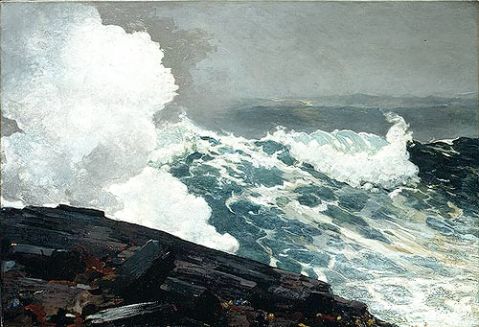
 The Life Line, 1884. Winslow Homer. (Philadelphia Museum of Art)
Homer, a New England native, began his career creating illustrations for Harper’s Weekly. His early paintings demonstrate a strong narrative component, of which “The Life Line” is a prime example. In this painting, we see a shipwrecked woman rescued by an anonymous (his face obscured by her scarf) man. The obvious themes (heroism, valor, human ingenuity) feel a bit cliche, even trite. Yet the collection of paintings, which bring together diverse strands of intellectual and art history, demand that the viewers address difficult questions about the value and preservation of human life amidst the demands of survival and commerce.
 Homer, who went on to create a stunning body of landscape paintings, later foregrounded nature and it’s massive, often prehistoric presence beyond the human scale.
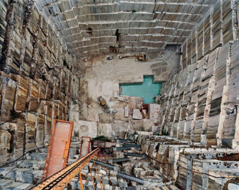
Well over a hundred years later, disaster at sea is far from the minds of Americans and their artists. However, our focus has now shifted to disasters of which we are not innocent bystanders, but active participants. The stunning work of Edward Burtynsky, a landscape photographer, depicts scenes of human impact on the environment. The images are profoundly different from the more Romantic works of Vernet & Homer, yet we still stare and gasp, and marvel at the shape, color and composition of disaster. 

Why You Love The Blues: Set Design Magic by Eve Stewart
November 26, 2012 § 1 Comment
 BBC’s miniseries “The Hour”, now in it’s second season, represents some of the most daring and exacting set design on television. Oscar-nominated production design master (and a professional hero to me), Eve Stewart, brings her talents to this 6-episode drama. Best known for her work on “The King’s Speech”, Stewart creates a lush but subtle world set in in 1950s London.

 Photos by OhSuchAPrimaDonna
Stewart balances the use of aqua blues with patterned and textured warm tones. The show’s drama unfolds mostly in the newsroom and it’s offices, painted in shades of grey and blue which evoke logic, modernity, and organization. We see warm colors, wallpaper and fabrics in more private scenes, driven by minor characters or extravagant behavior and events.
I love nearly everything about BBC’s “The Hour”: it’s characters, the writing and the tone. But most of all, I love the visual treasure Stewart has created, in which almost any screen shot or production still could function as a study for an Edward Hopper painting. Each scene in “The Hour” really is a work of art.
Stewart, perhaps best known for her work on “The King’s Speech”, also served as the art director for the upcoming production of Les Miserables. The acting, singing and directing will all be wonderful, I’m sure, but I’m most looking forward to the background.
 Hallway from “The King’s Speech”
 Stewart’s Production Sketch for “Upstairs Downstairs”, Courtesy of PBS
Stained Glass for the Modern World
November 12, 2012 § Leave a comment


As much as I adore patterned walls, some environments are better suited to finishes without motifs. Often, institutional or corporate settings require more neutral wall finishes. However, windows can present an incredible opportunity to introduce pattern!
I adore the pattern used in this window at The House Cafe Corner in Istanbul (pictured above). Of the many ways to create crisp, patterned window finishes, fritted glass is by far the most durable and functional. Fritted glass involves baking a ceramic glaze directly onto the glass.

The resulting glass can create depth, texture and movement within the 2-D window surface. What an incredible way to introduce pattern to a modern structure!

Wiel Arets Architects: University Library UBU, Utrecht, Netherlands, 2004
Forest Inspired Wall Art
November 2, 2012 § 1 Comment
I love how the fall has a way of opening up the trees, allowing us to see their graceful limbs and delicate leaves. This year I’ve been especially inspired by my visits to nearby gardens and arboretums. Check out this fall leaves pattern I developed!

Also this fall, I discovered the artwork of Julie Anne Mann. Her haunting, spiritual drawings of trees onto large walnut panels feel both eerie and comforting. The collection, appropriately named “Forest Portraits”, presents trees with personalities, attitudes and flaws. I especially love the portrait titled “The Lovers”, on display last month at the Wexler Gallery. Hand drawn with delicate silver leaf, I would absolutely love to have it on one of my (unwallpapered) walls.

Little Serow: Big Design in a Small Space
October 15, 2012 § 1 Comment

During our honeymoon, we traveled through D.C. and ate at the most lovely restaurant, “Little Serow“, near Dupont Circle. The incredible basement space, formerly a Dunkin Donuts, looks and feels like you’ve walked into someone’s home in Northern Thailand. The color and texture of the space felt so reminiscent of the room I rented while living in Guatemala, I had to include a photo (see below)
Chef Johnny Monis and his wife, Anne Marler, inspired during their travels to Southeast Asia, developed the restaurant concept as well as designed the space. The aqua teal walls feel pitch perfect, as does the corrugated tin ceiling. No computers are visible (the serving staff pulls out the point-of-sale computer to process payments from a drawer), and they don’t have a phone. The no reservations, no substitutions, no frills, 28 seat dining space works (and tastes) wonderfully.
Pattern and softer textures missing from the interior finishes are incorporated into the delightful plateware and vintage dresses worn by the serving staff. The cool green walls help diners feel relaxed and calm while eating the deliciously spicy food, while the small touches of floral pattern help you to feel even more relaxed and at-home in the bustling little restaurant.


Elixr Cafe: Wallpaper, Any Way You Like It
September 21, 2012 § 1 Comment

Many thanks to the talented team at Greensaw Design & Build who invited me to consult on the beautiful new Elixr space. I designed the wall treatments, which add a warm touch to the rustic, industrial-style cafe. I love how even a small amount of wallpaper can either dramatically, or subtly transform a space. For example, I chose a more delicate, lattice-style floral paper for use behind the coffee station, which beautifully blends in with the brick, wood, and coffee merchandise. However, on the entry wall, I wanted a bright, dramatic pattern to make a statement and set the tone for the space. Wallpaper can often be much more durable than paint, so it’s helpful to remember that it doesn’t always have to be noisy and colorful, it can be more quiet and subtle.


In the bathroom, I hand applied a geometric pattern using warm tones to create a homey, welcoming atmosphere without it feeling too decorated or dramatic. The pattern fades in and out of sight, which adds to it’s character and subtle complexity.
